

Sfermion raises $100M for NFT and metaverse ventures
November 1, 2021
Bitcoin Mining Operation Genesis Digital Assets Announces New Data Center in West Texas – Mining Bitcoin News
November 1, 2021
Bitcoin price closed the month of October with a higher high on the candle closing, a feat that has throughout history always led to a renewed bull run and additional all-time highs.
Coinciding with the November monthly open, here are ten bullish Bitcoin price charts that suggest bullish continuation is ahead – but also warns that the eventual end to the market cycle is near as well.
Ten Bullish Monthly Bitcoin Price Charts
The leading cryptocurrency by market cap has made a higher high on the highest timeframes – a clear signal that the trend has yet to conclude. By pure definition, an uptrend is a series of higher highs and higher lows. The two boxes have been checked by Bitcoin, and it is time for the market to respond.
Below you’ll find ten monthly Bitcoin price charts and the bullish factors they exhibit. For all of the bullish technicals, there are two important things to note. When the move ahead appears this obvious and the crowd expects it to happen, the market often does the opposite. Also, such overheated monthly technical indicators – as bullish as they may be – signal the end is also near.
Relative Strength Index (RSI)
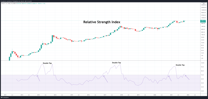
The Relative Strength Index measures the strength of an asset’s underlying price action and can tell analysts when an asset is overbought or oversold. A reading of under 30 suggests conditions are oversold – something that’s never happened on monthly timeframes when trading the first ever cryptocurrency.
Above 70 typically suggests an asset is overbought and its time to sell. But on monthly timeframes in Bitcoin, this only has indicated in the past when FOMO is at the highest, and buying is in a frenzy. There is no telling when the top might form based on the monthly, only that a peak is near and will happen closer to the previous RSI top set back in April this year.
Ichimoku

The Ichimoku can be a confusing tool to look at if you don’t know how to read it. But in the right hands (or with the right set of eyes), the tool gives the clearest signals of all. Note how the lagging span, projected backward behind price in green – which is used to highlight support and resistance – set a higher high similar to the 2013 mid-cycle peak. The 2013 finale or the 2017 cycle top did not.
Bitcoin price is also above both the conversion line and the base line, which is a bullish signal in and of itself. These lines are also crossed bullish, and the cloud has a tiny bullish twist suggesting a short pulse of bullish momentum ahead.
Parabolic SAR
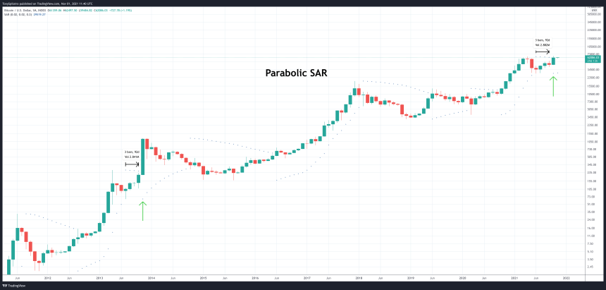
Before we get into more complex signals and technical indicators, we’ll stop (pun intended) quickly at the Parabolic SAR, created by J. Welles Wilder, one of the pioneers of technical analysis.
Related Reading | Bitcoin Price Prepares To Blast Off Back Into RSI “Bull Zone”
SAR stands for “stop and reverse” and it tells an analyst when a trend has done so. Notice that at the mid-cycle peak in both 2013 and 2021, the rally then restarted after just four months of downtrend according to the Parabolic SAR.
Fisher Transform
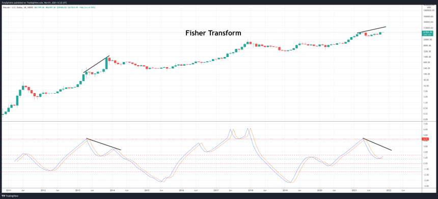
The Fisher Transform is a tool that normalizes price movements to filter out noise and make points of reversal or price extremes easier to spot, based on standard deviations.
The mid-cycle pullback in Bitcoin price happened to reach the same standard deviation as the 2013 bull cycle, a level that also briefly held as support in 2017. A bearish divergence with a lower high on the indicator while price pushes higher would be a signal that the bear market is here.
Keltner Channel
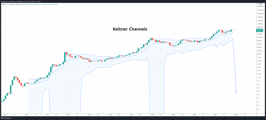
No, these aren’t the Bollinger Bands, but the Keltner Channel is another volatility tool that, according to Investopedia, is designed to aid in trend recognition and spotting reversals.
The biggest factor suggesting a climax to the cycle is on the way, is the lack of the bottom band falling out as it has on past cycles when they’ve come to a conclusion. The market hasn’t seen anything yet in terms of volatility this cycle.
Super Guppy
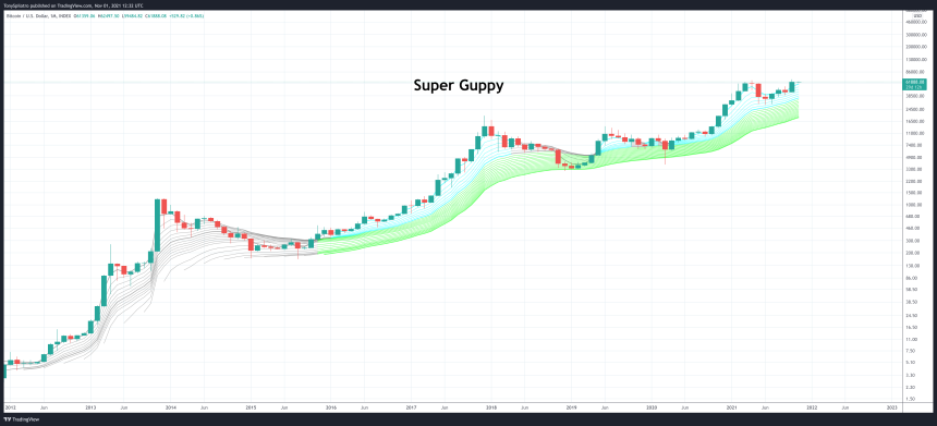
This ribbon made of exponential moving averages (EMAs) makes it very clear when an asset is trending up. On the monthly timeframe, that’s pretty much been the only direction the cryptocurrency has ever known.
However, there is zero compression of the ribbon as past bear phases have shown, and Bitcoin price has closed a monthly candle above all of the EMAs signaling a strong trend is forming.
Williams Alligator
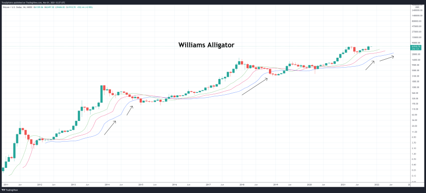
The Williams Alligator was created by early market psychology pioneer Bill Williams. It consists of three smoothed moving averages based on the Fibonacci sequence: 5, 8, 13. The three averages are called the tool’s Jaw, Teeth, and Lips.
The tool currently shows that the Alligator is feeding into the trend, with the moving averages diverging and moving upward – a clear sign of continuation.
Awesome Oscillator
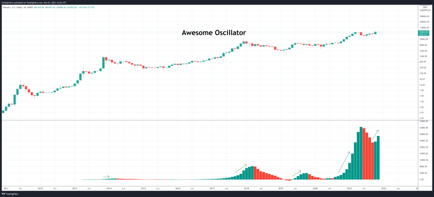
The Awesome Oscillator is awesome because it gives simple signals. The momentum measuring tool can help to affirm trends and preempt market reversals, according to MoneyControl.
The histogram adding two green ticks as the price moves upward is a sign that the cycle hasn’t likely concluded, and is about to get a lot more awesome.
Donchian Channel
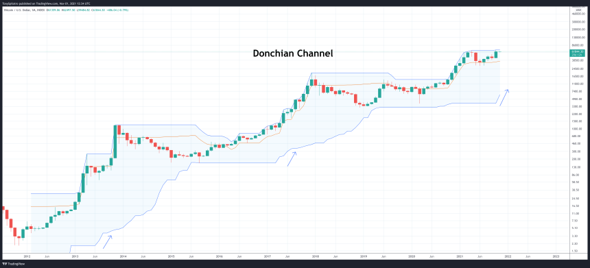
Another Bollinger Band lookalike, but this one works very differently. The Donchian Channel is based on Bitcoin’s Average True Range, and is depicted by the lower and upper bands. The middle-line is the market median, or what is likely a fair price for the cryptocurrency.
Passing above or below the media indicates the direction of the trend, which is still headed up. Confirming this further, is the fact that the upper and lower bands are starting to move up, showing that the Average True Range of Bitcoin is forever moving away from low prices set at the bear market bottom.
Money Flow Index (MFI)
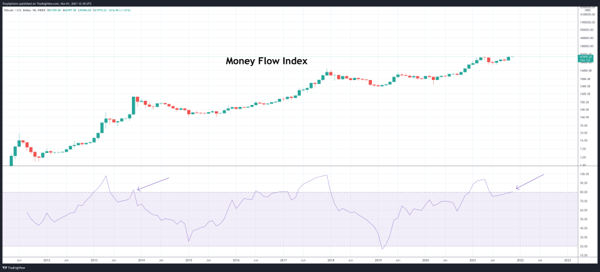
The Money Flow Index signals when an asset is overbought or oversold similar to the RSI, but also takes into consideration volume data.
The addition of volume makes finding divergences easier. Comparing to the RSI at the top of the article, the second top of the 2013 double top on the indicator is significantly truncated on the MFI. The short, sharp spike was impactful during the 2013 finale, and could suggest that there isn’t much time left in the current bull cycle.
Related Reading | Want To Learn How To Read Bitcoin Price Charts? Click Here
(Cycle) Conclusion
There are a lot of bullish signals in Bitcoin price action currently on the highest timeframes. Elliott Wave Theory also has provided the roadmap for a potential wave 5 situation. However, the macro situation is bleak, and the cryptocurrency asset class remains speculative and ultra sensitive to things like regulation or Black Swan events.
There is also no telling where the music stops. Bitcoin price could fall short of expectations of $100,000 or higher, causing a sharper selloff and more severe bear market. The cryptocurrency could blast far past that barrier and then some. What is guaranteed, is that what goes up, must come down, and after the bull cycle parabola breaks down completely, the leading cryptocurrency by market cap is likely looking at around an 80% drop to the bottom.
Follow @TonySpilotroBTC on Twitter or join the TonyTradesBTC Telegram for exclusive daily market insights and technical analysis education. Please note: Content is educational and should not be considered investment advice.
Featured image from iStockPhoto, Charts from TradingView.com


